
Empire is a British movie magazine that I redesigned to focus more on the aesthetic sides of the movies and their atmosphere, especially in the Features. The reason is that the magazine was known as a commercial publication for a few decades.
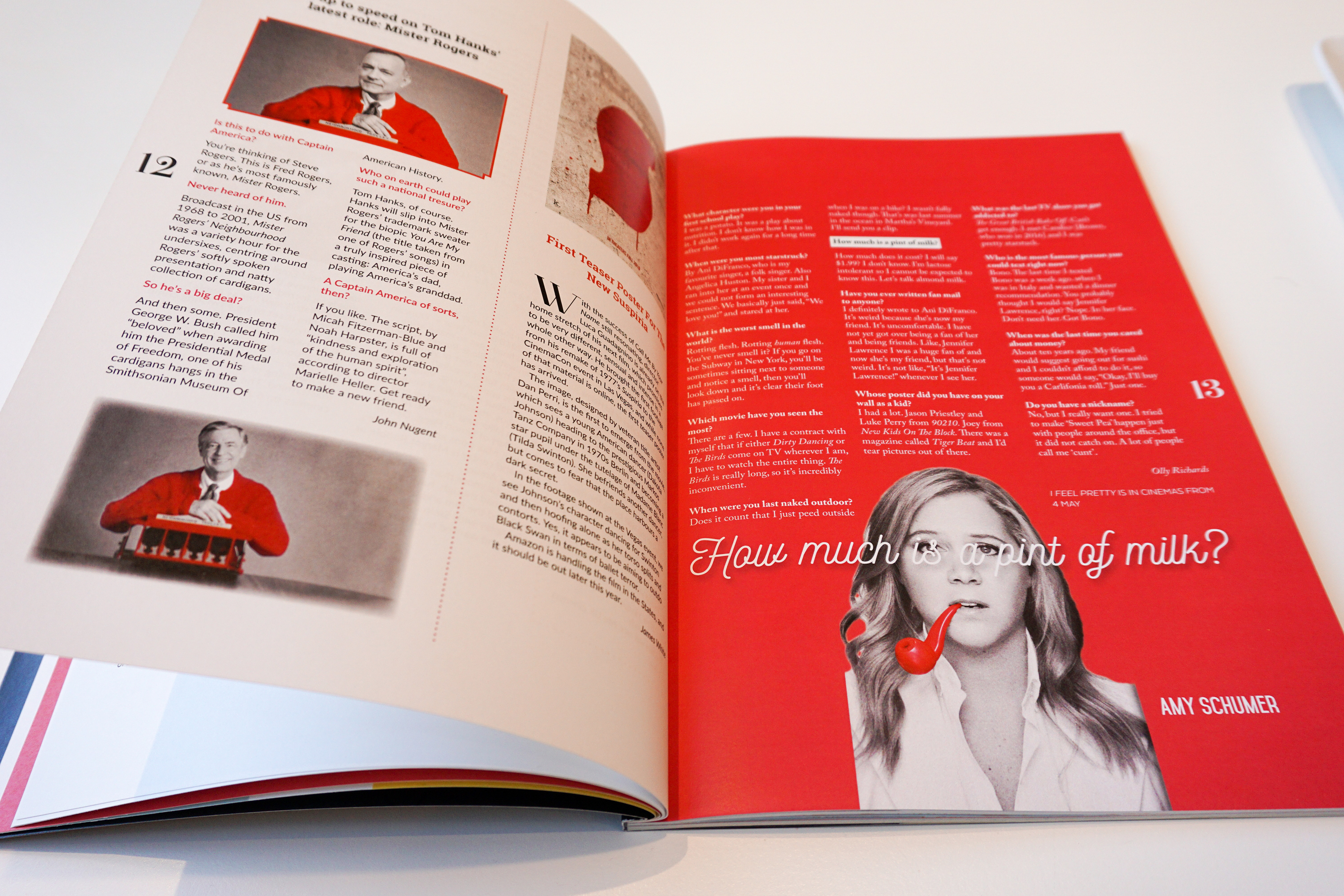
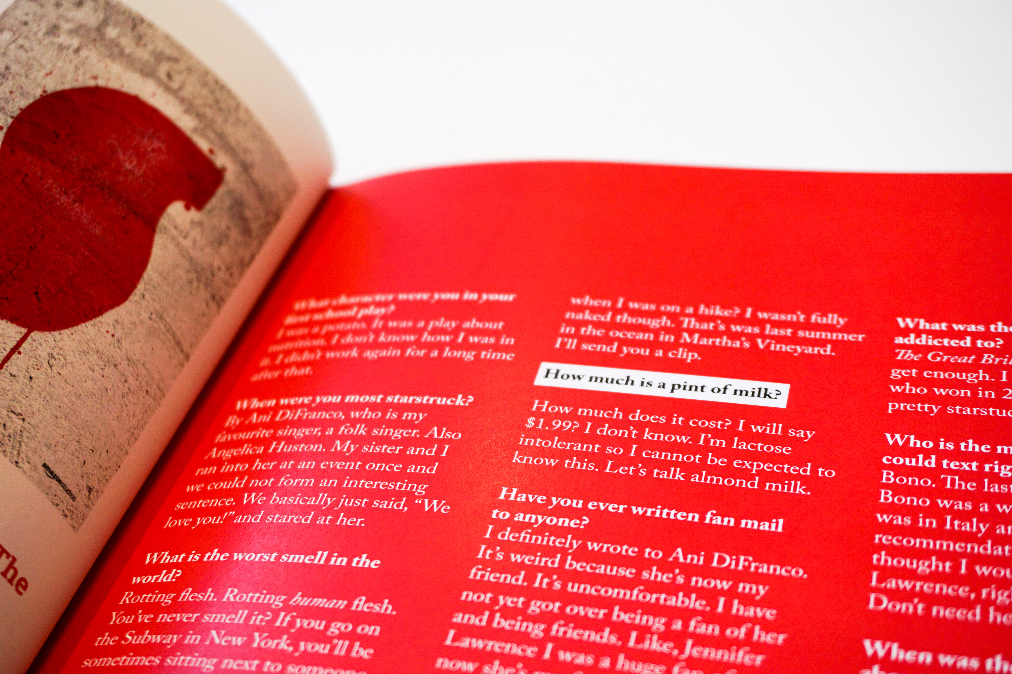
The original magazine consists of three regular sections: Preview, On screen and Review, while I changed them into: Buzz, In cinemas and At home and kept How much is a pint of milk? and Classic scene as identical articles of Empire issues.
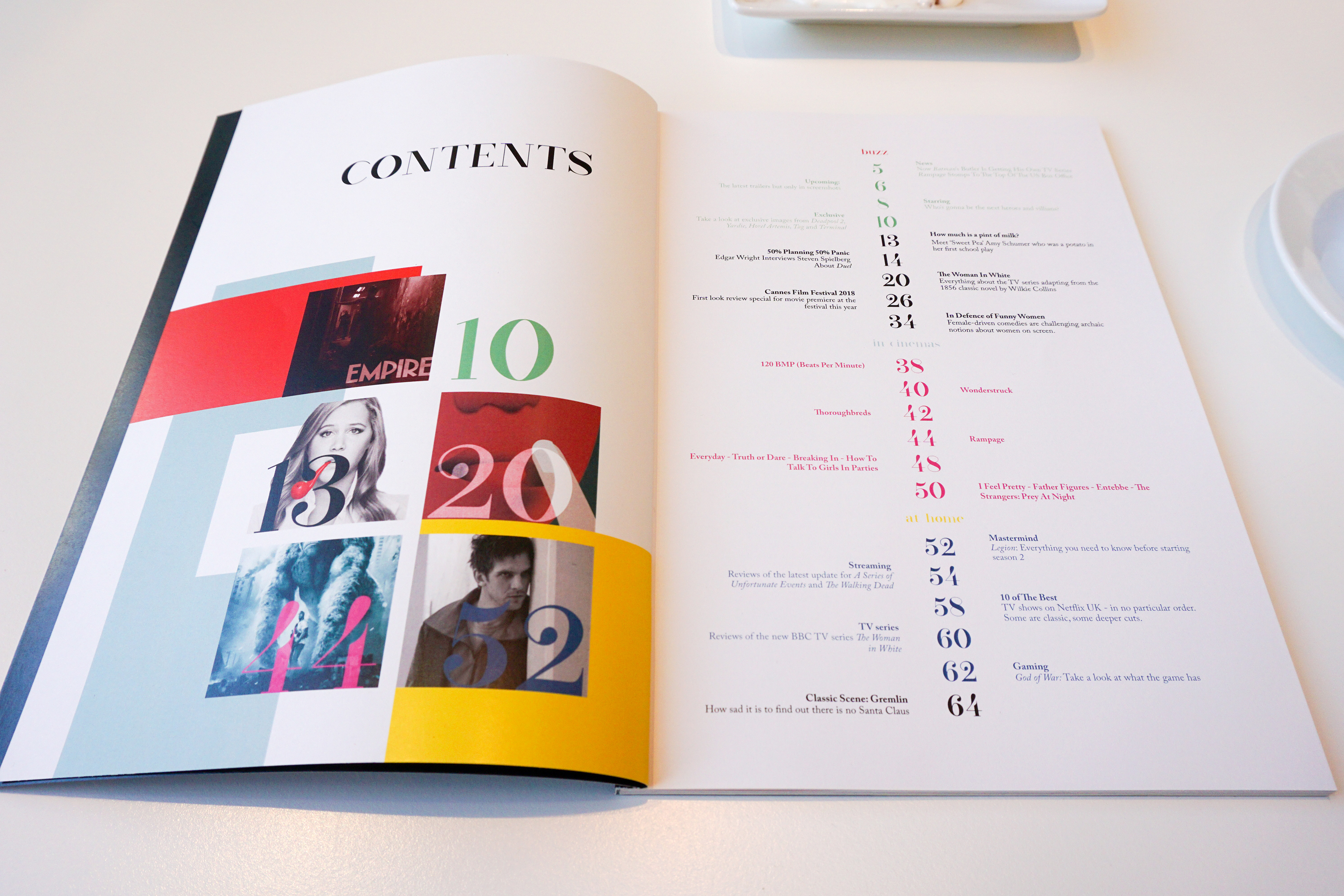
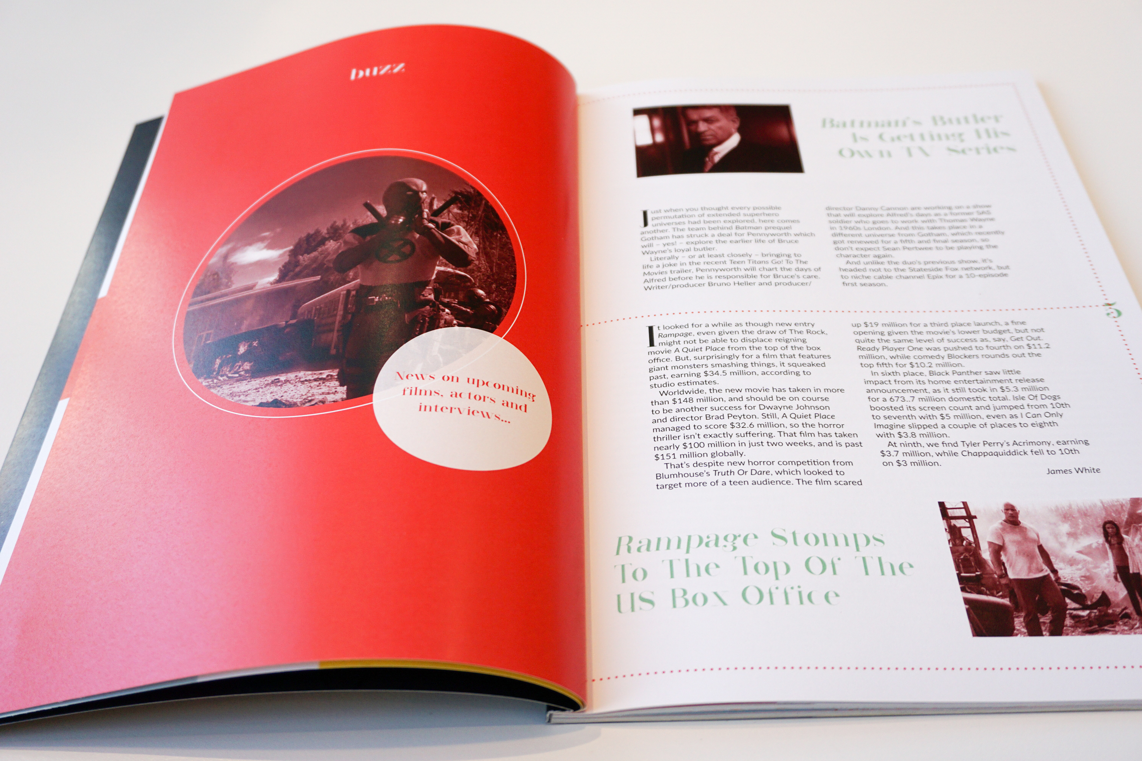
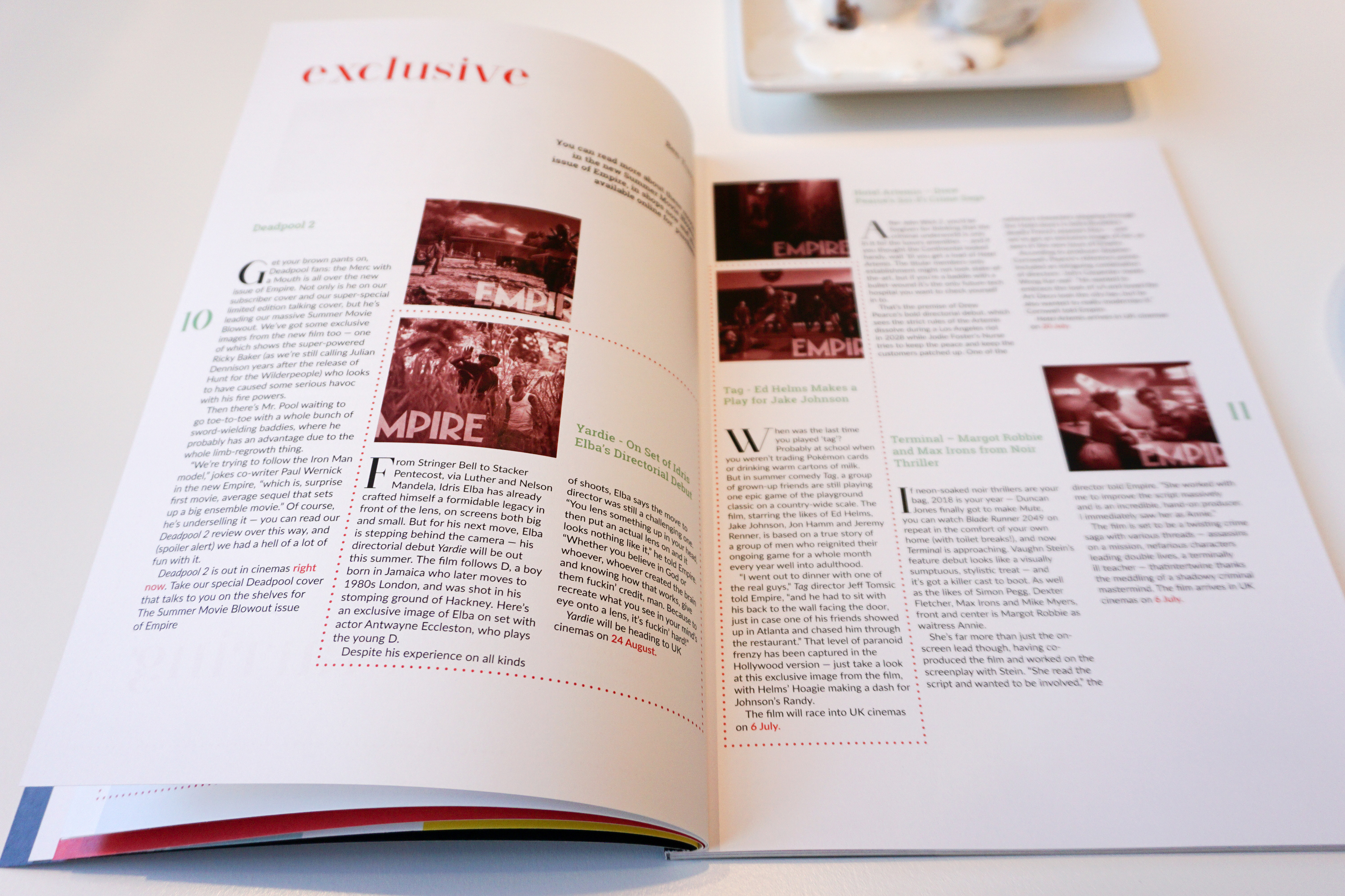
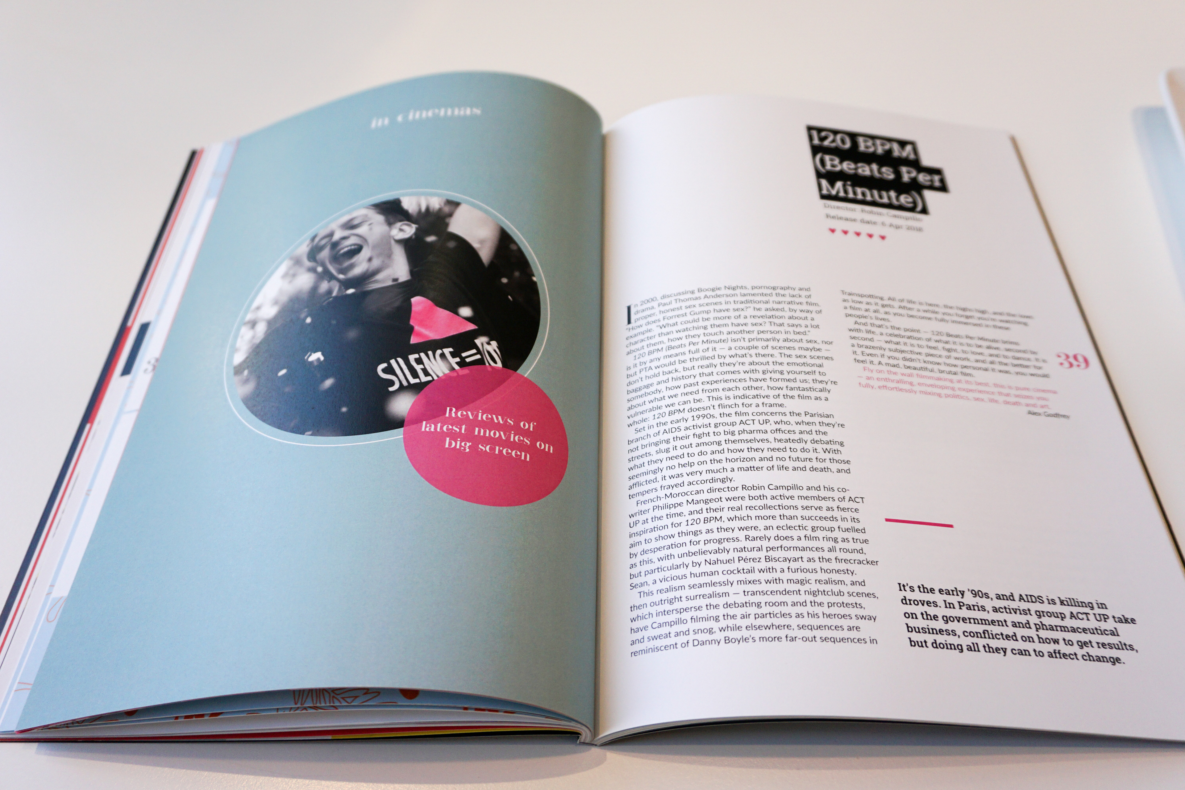
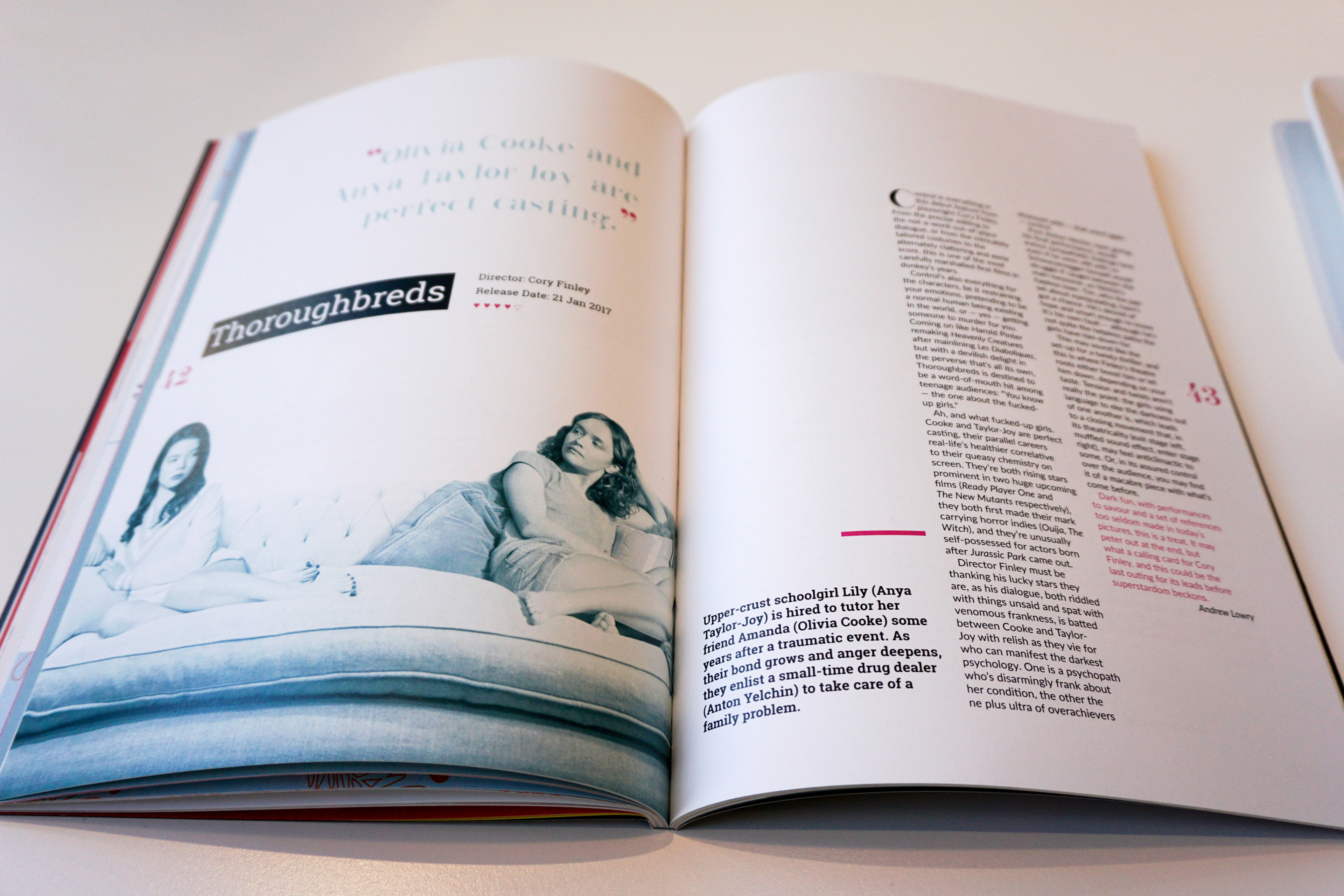
To make the magazine consistant, especially in the regular sections (buzz, in cinemas and at home), I used three couple of colors for color coding.
Sectioning:
Rename and rearrange the sections:
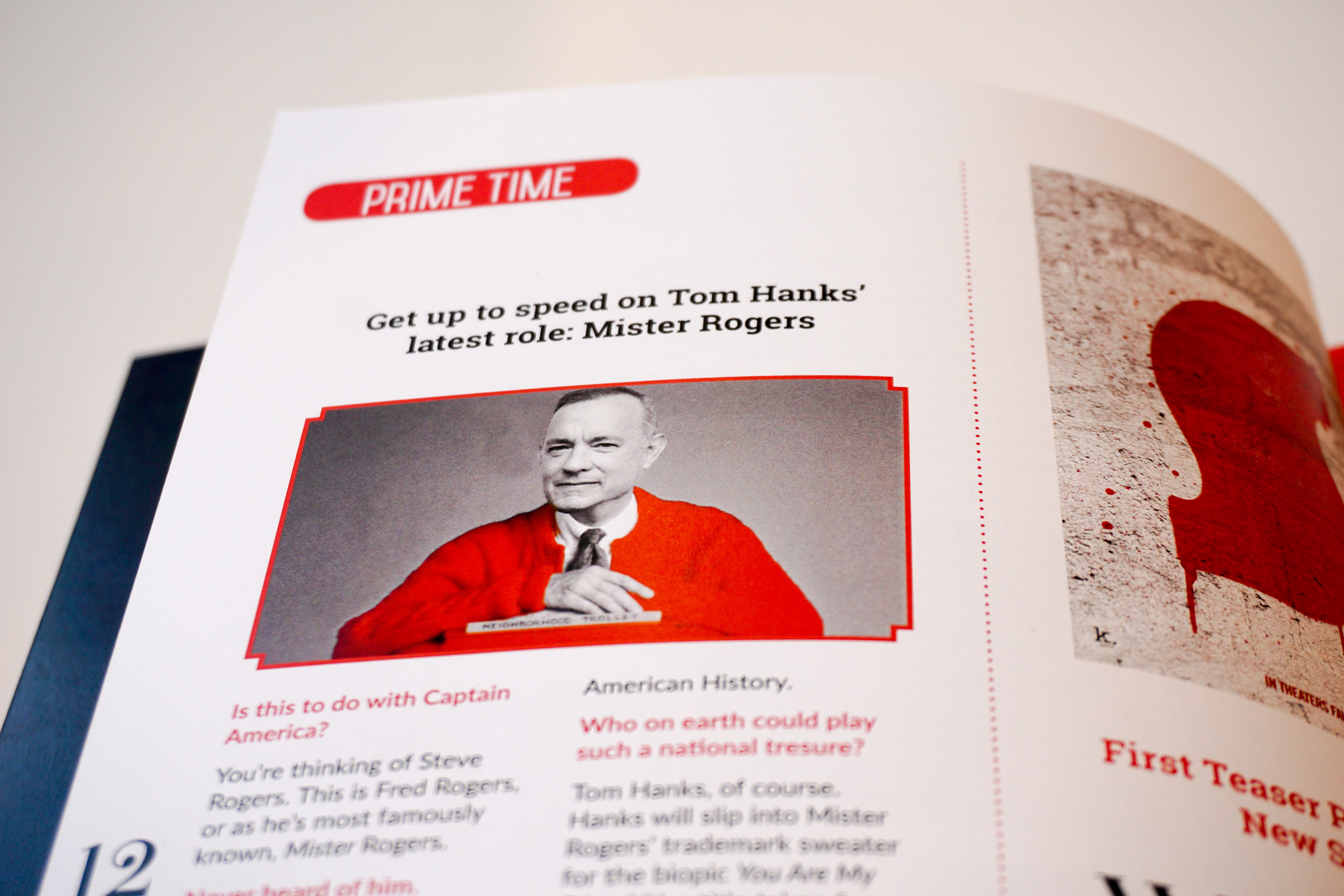
Buzz for news
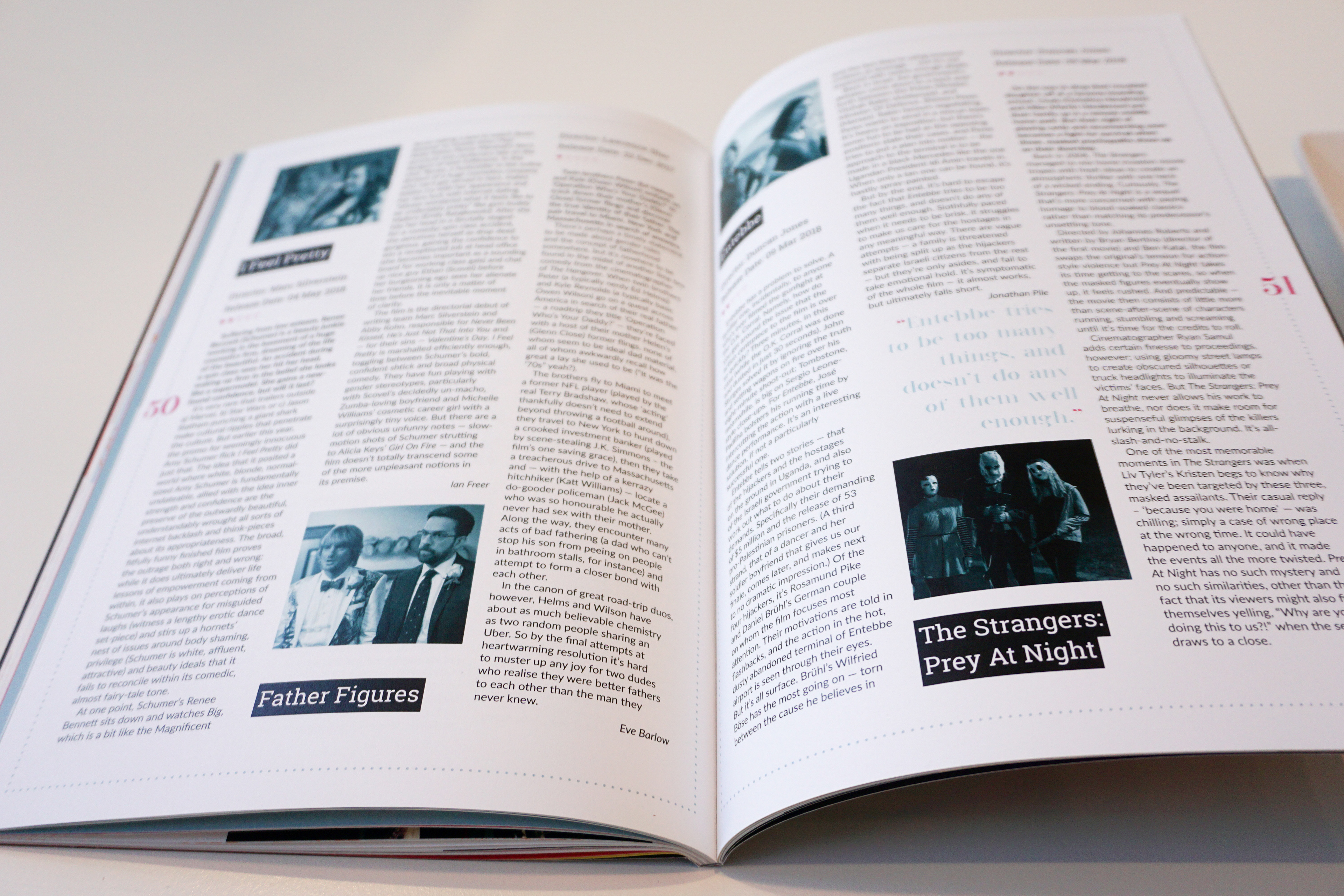
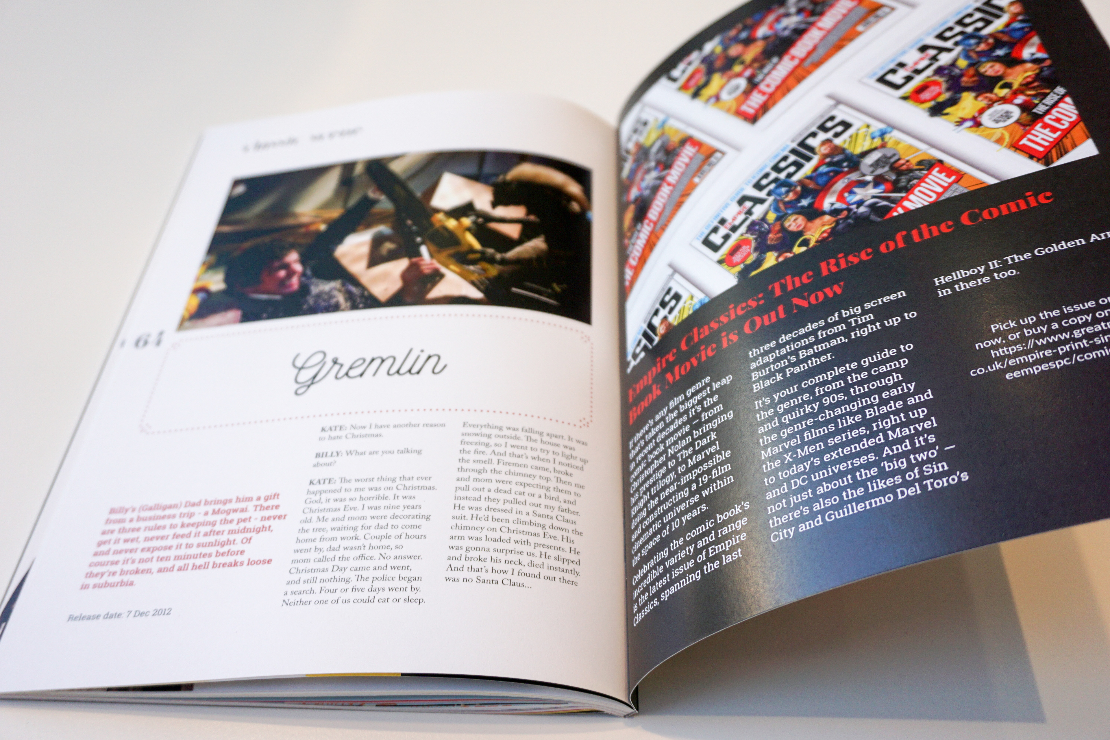
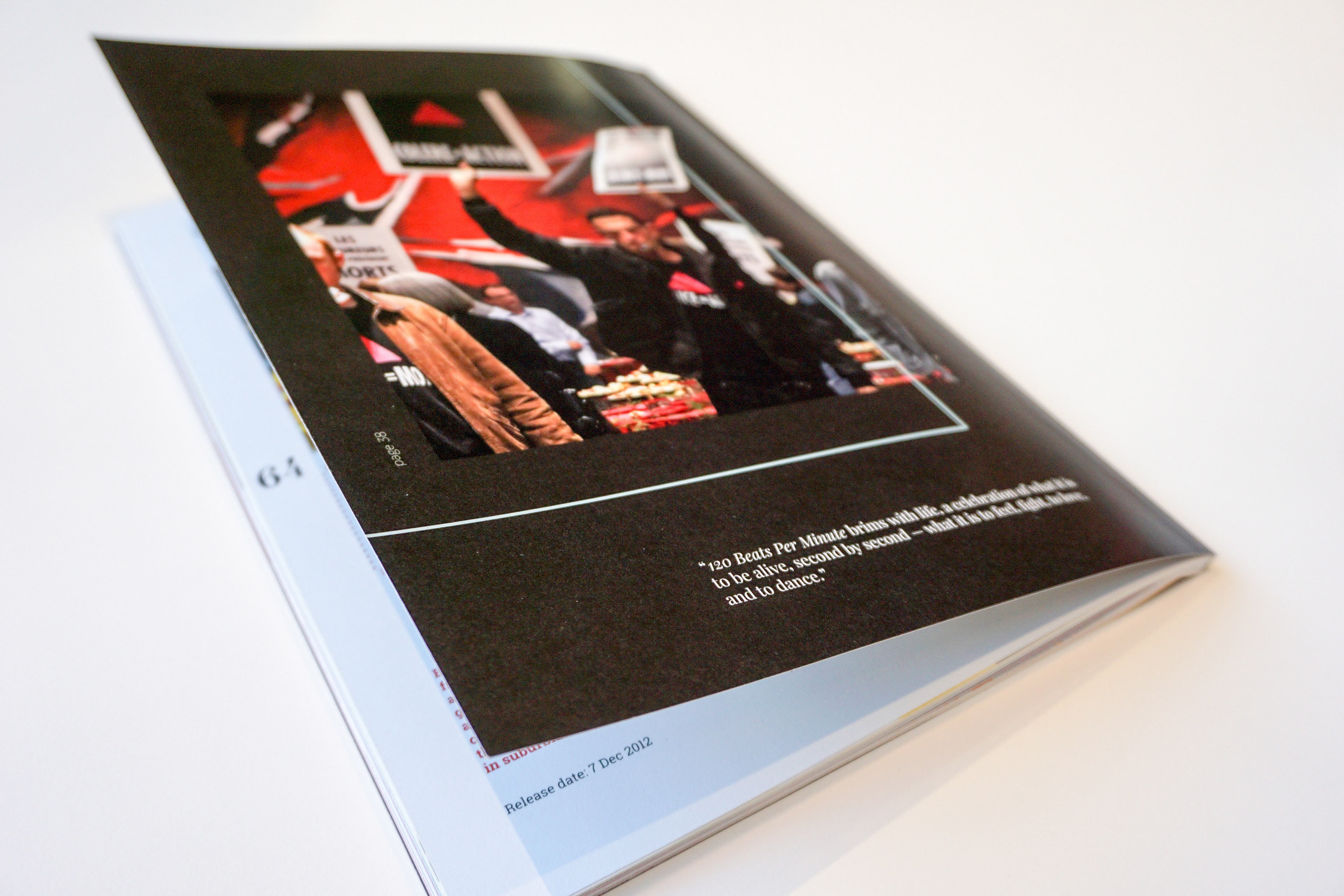
In cinemas for movie reviews
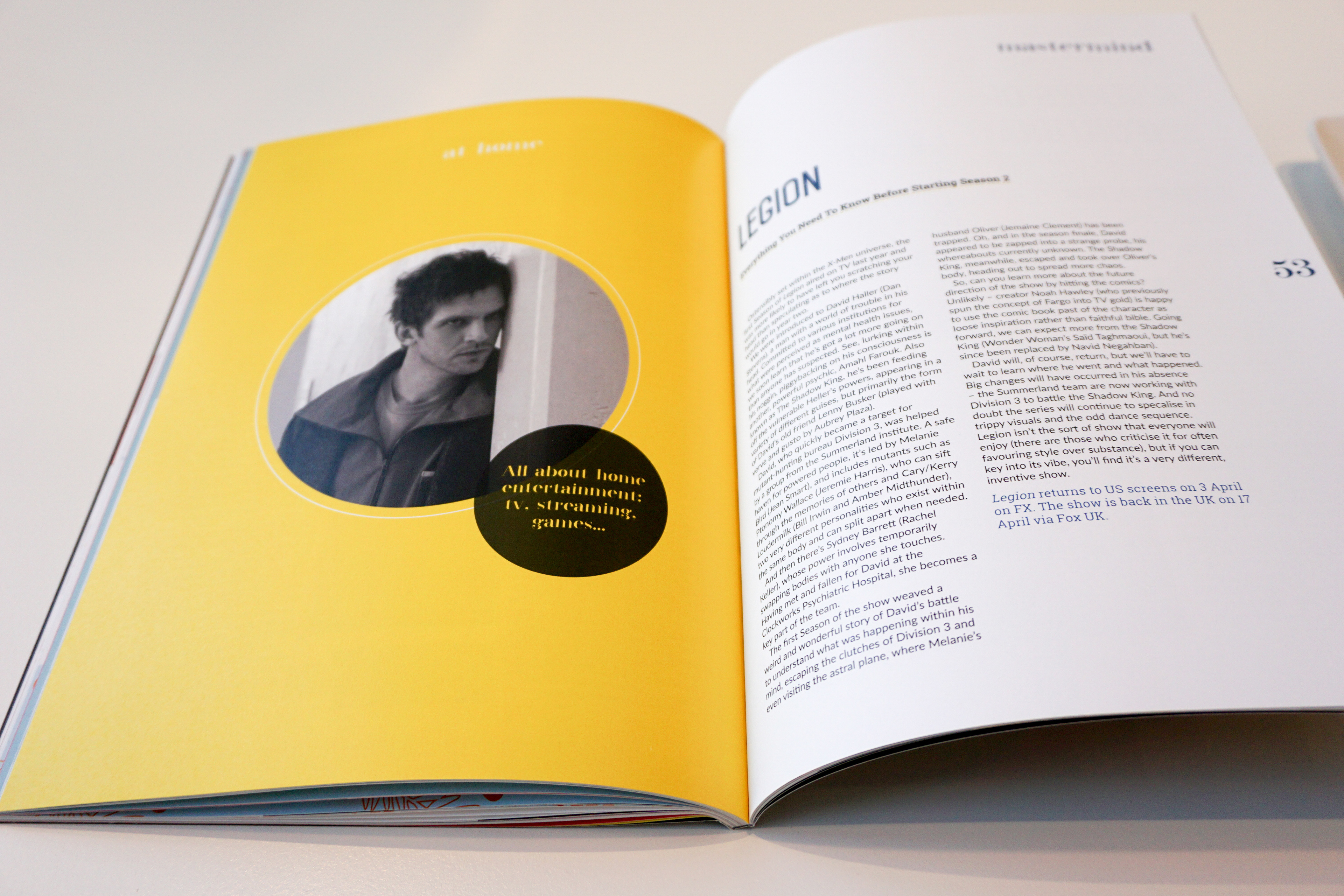
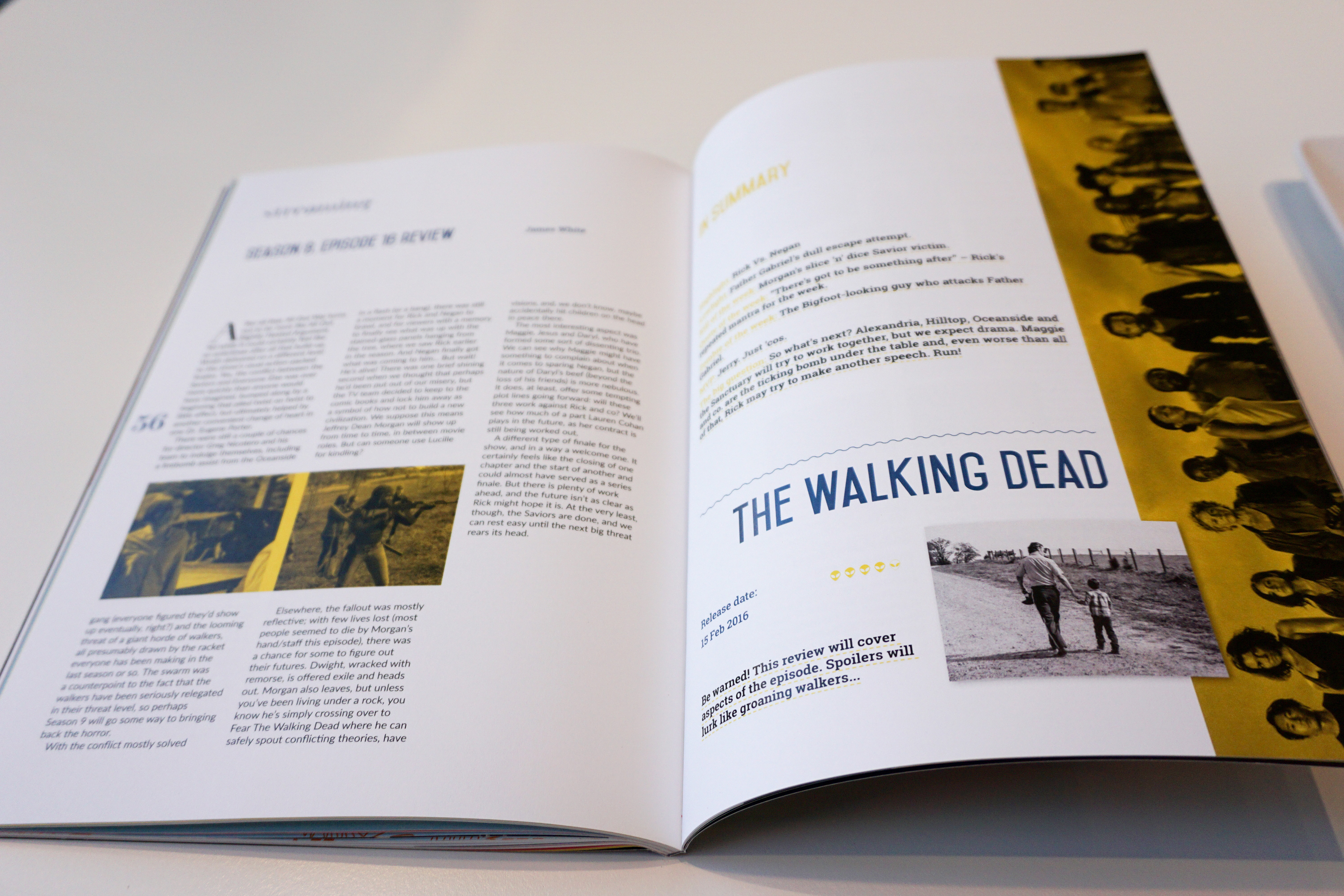
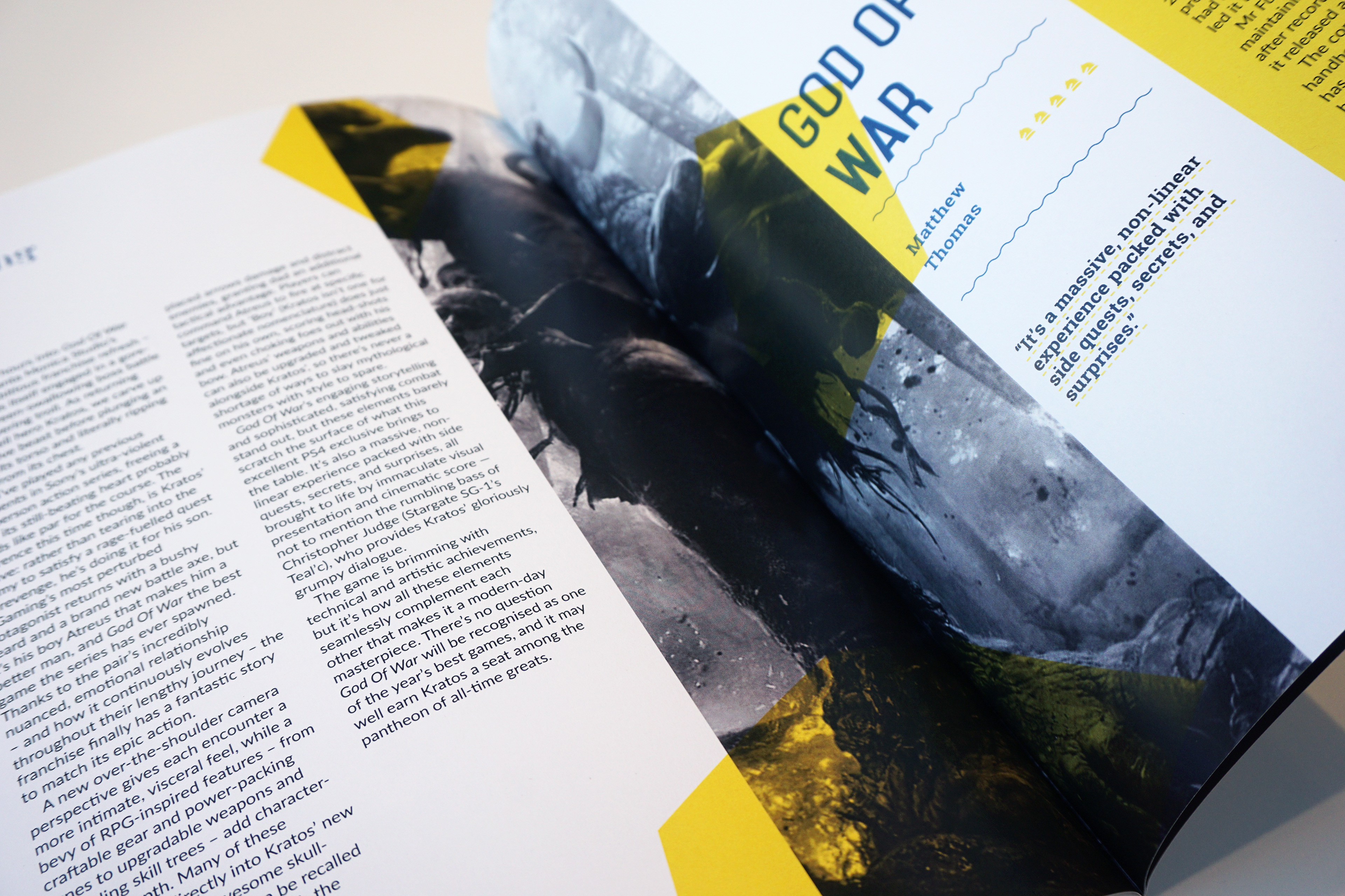
At home for home entertainment including streaming, tv, gaming...
Buzz for news
In cinemas for movie reviews
At home for home entertainment including streaming, tv, gaming...
Use color for spreads, content pages and pagination (placed on the left and right margin)
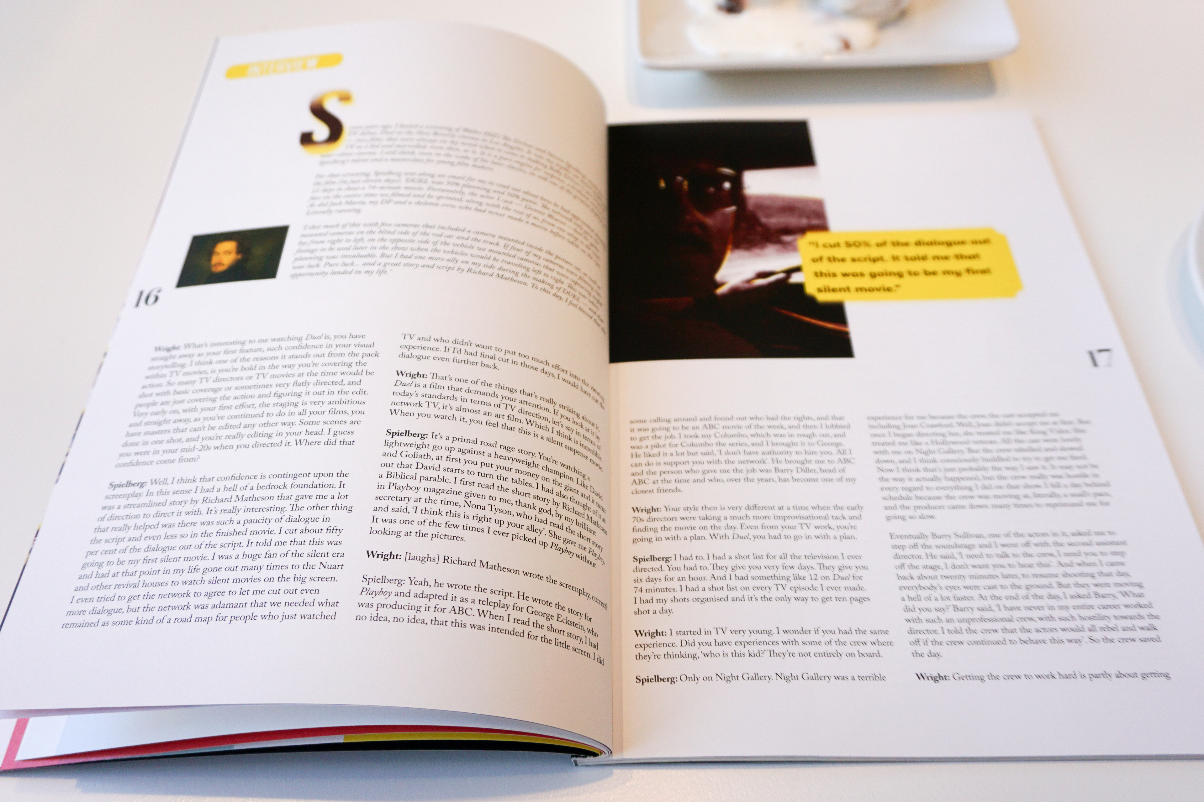
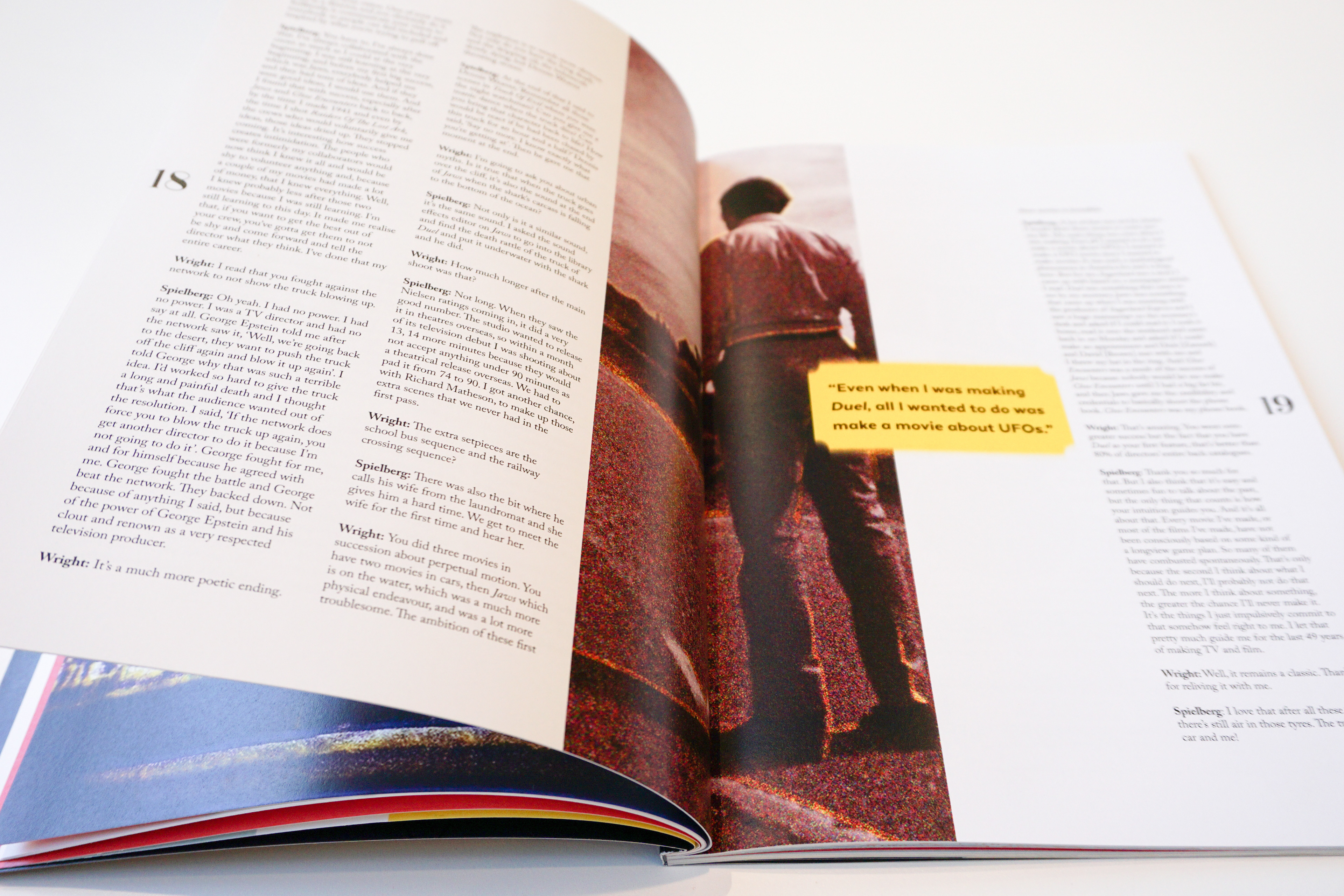
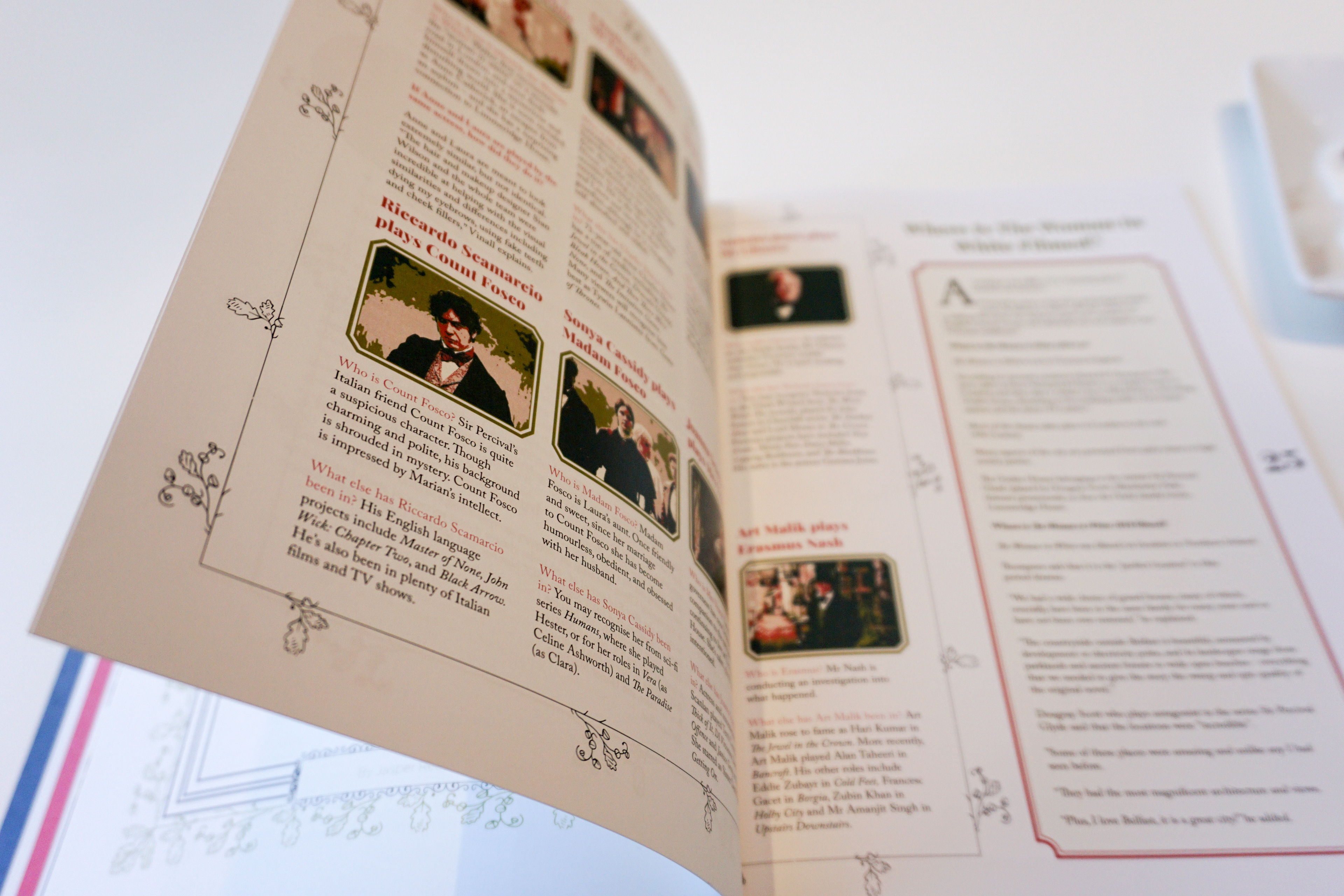
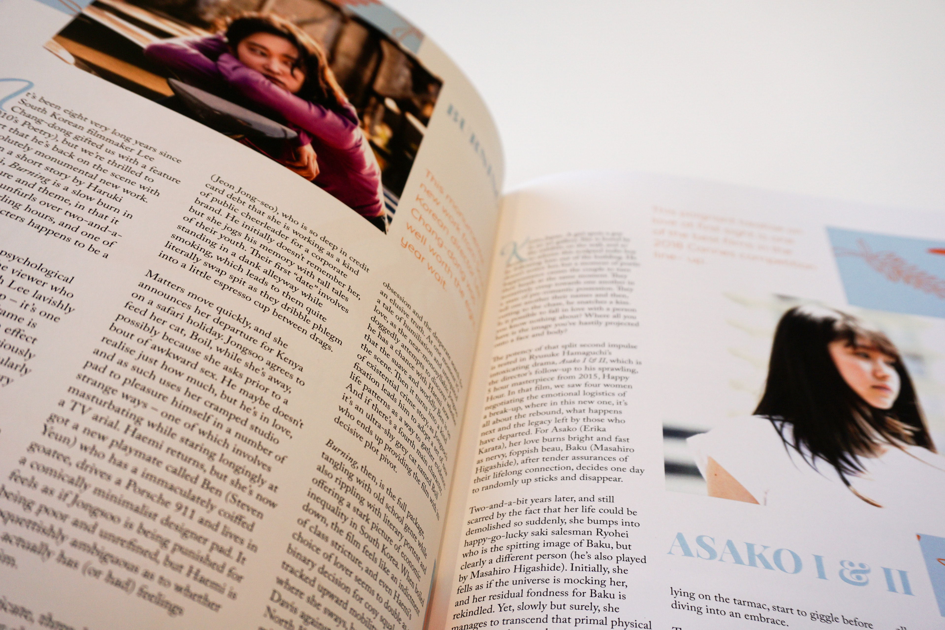
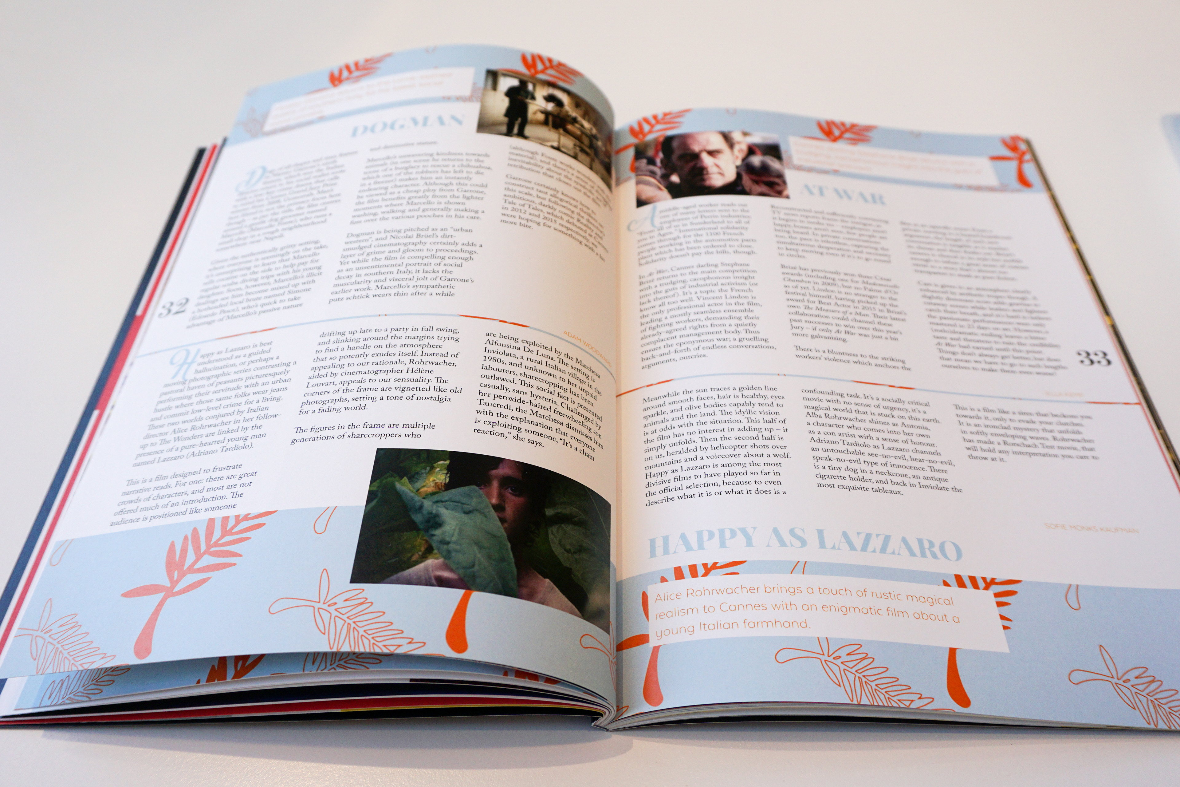
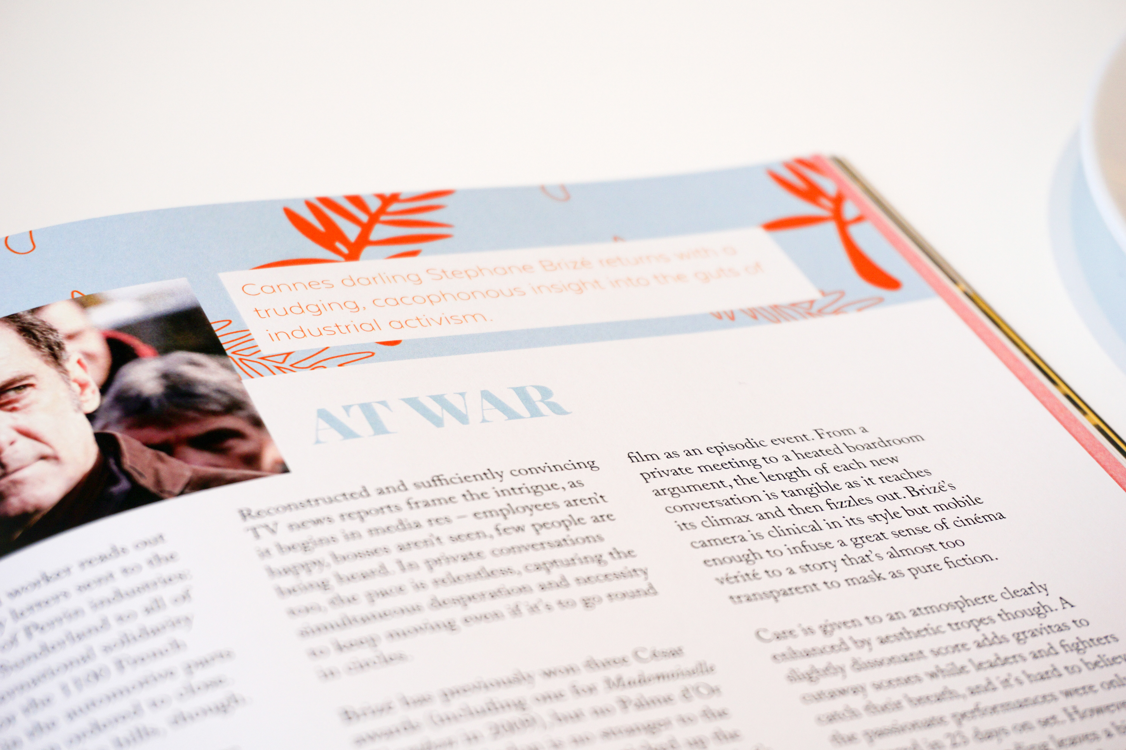
All images were edited with an overlay color in the color coding rule in each section, while making images in different styles for features.
All images were edited with an overlay color in the color coding rule in each section, while making images in different styles for features.

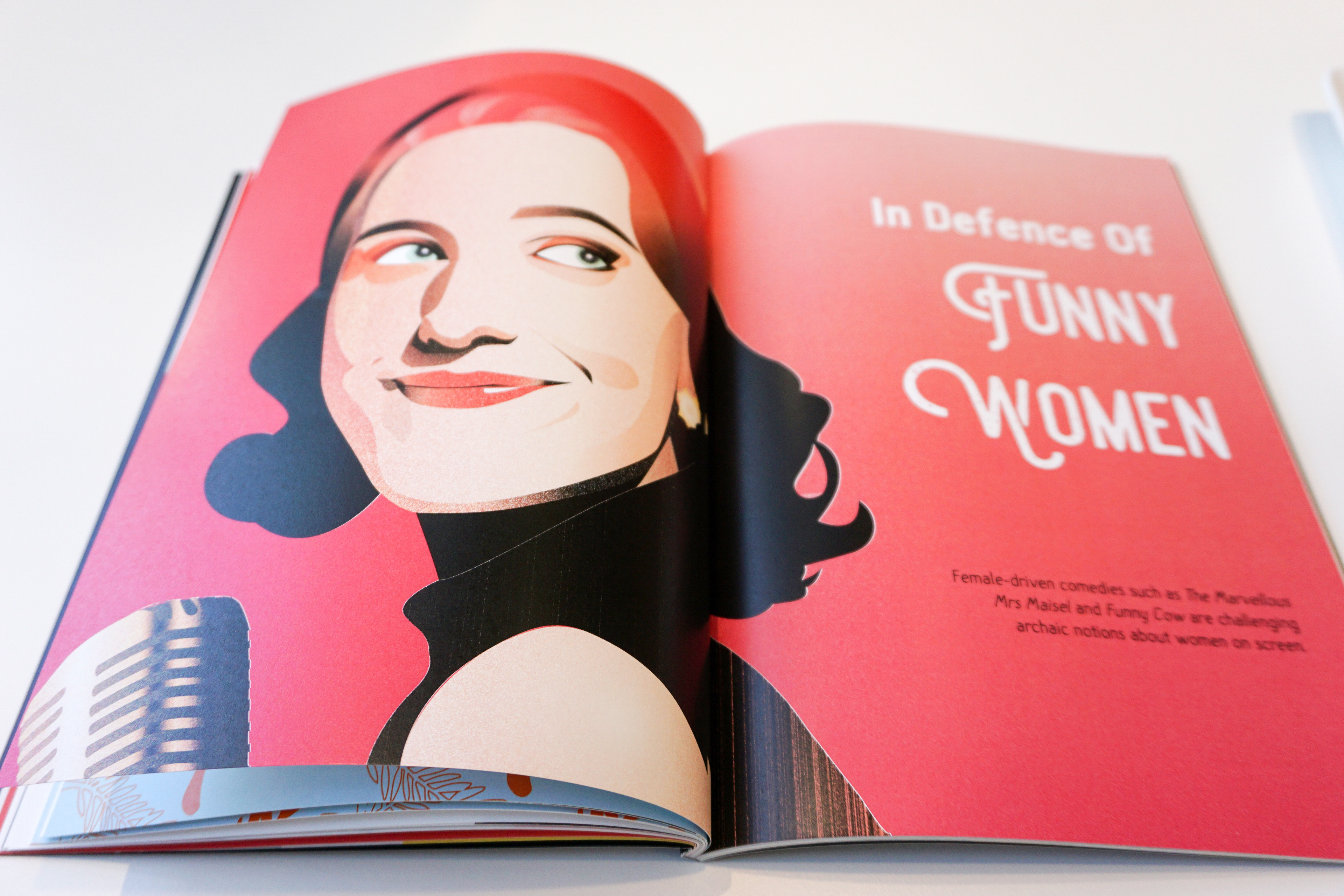
Illustrations by me
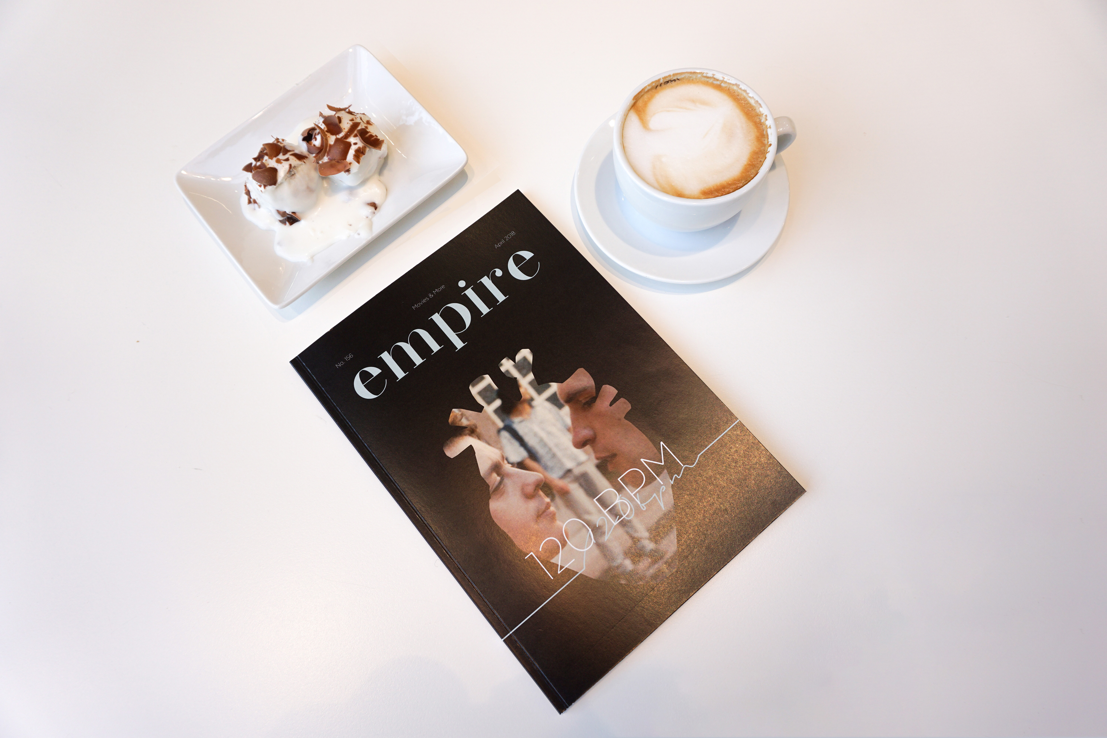
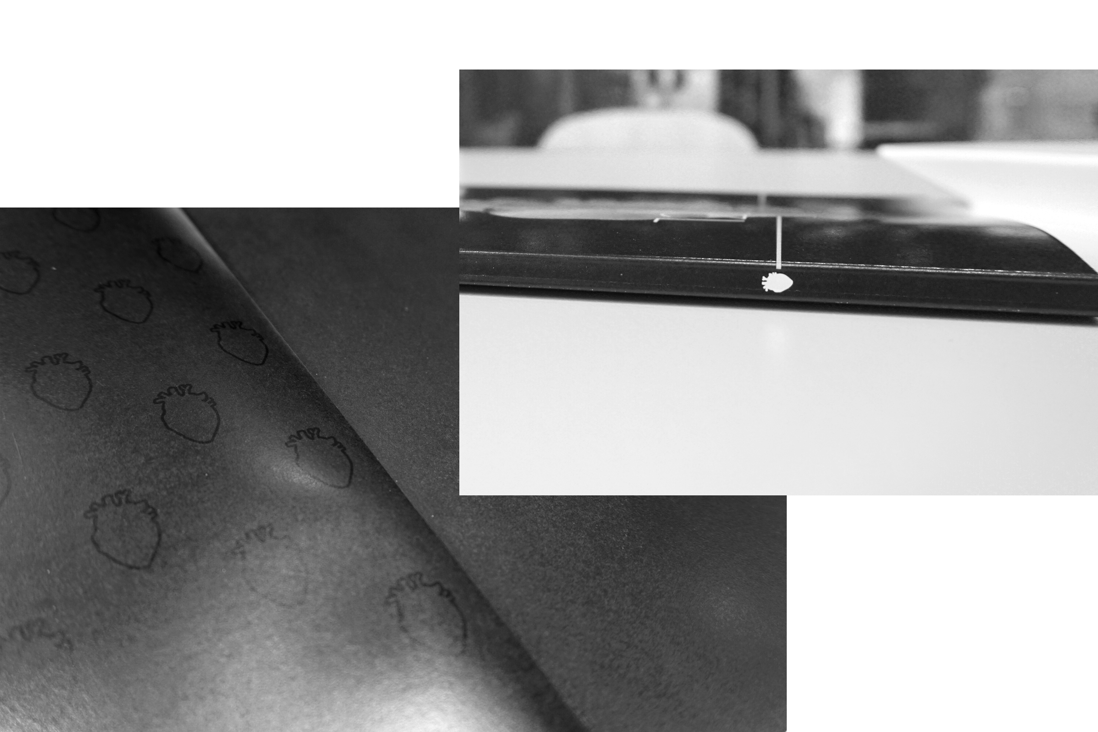
The heart shape on the cover was made into a pattern used on the inside cover. It is also placed on the spine of the magazine and my redesign idea is to have this symbol based on each month's cover. This makes the magazine a collectible itemwhen people put a series of Empire on their shelves, it shows a lot of different symbols representing the movie of the month (mostly rate 5 "hearts" by Empire reviews).
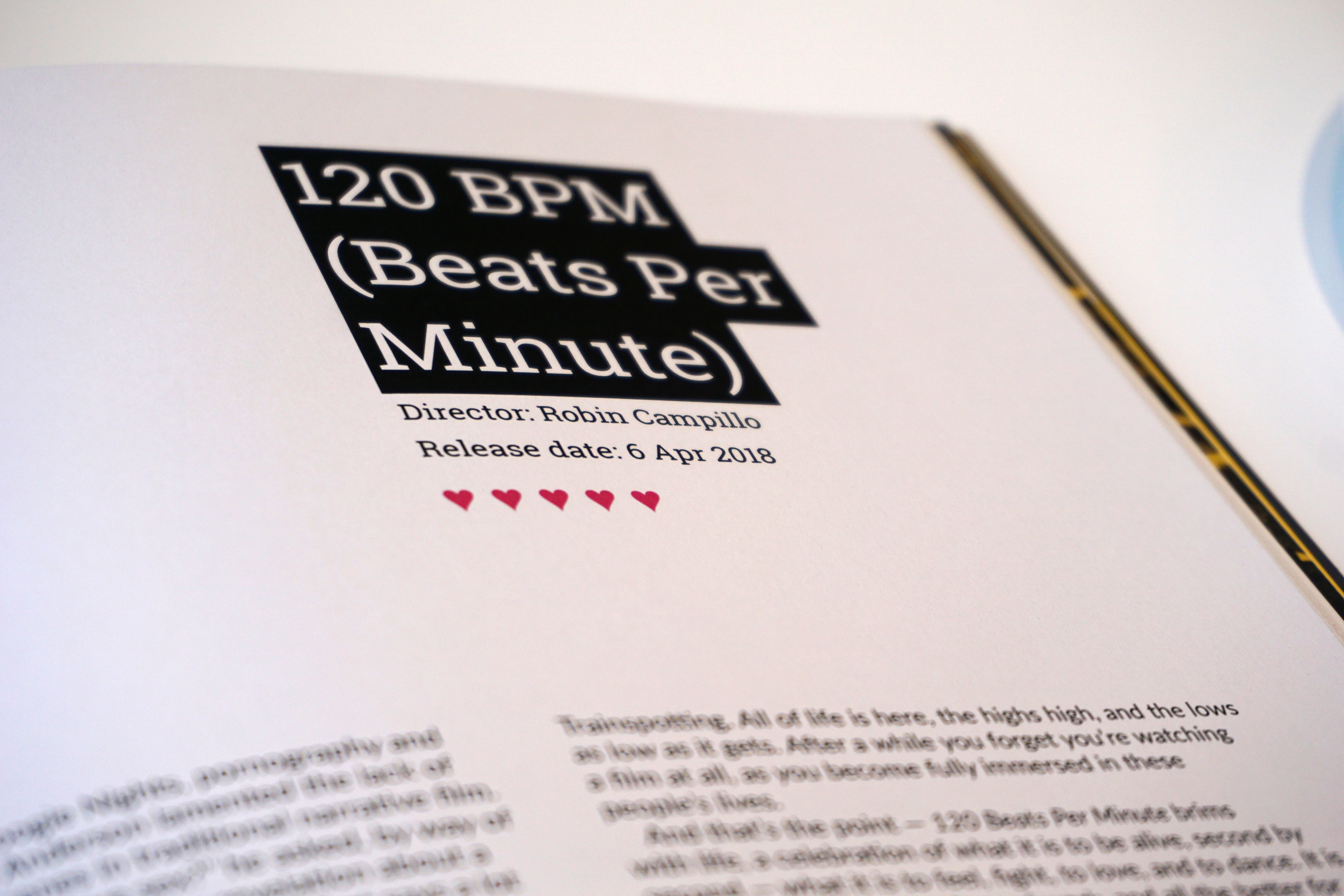
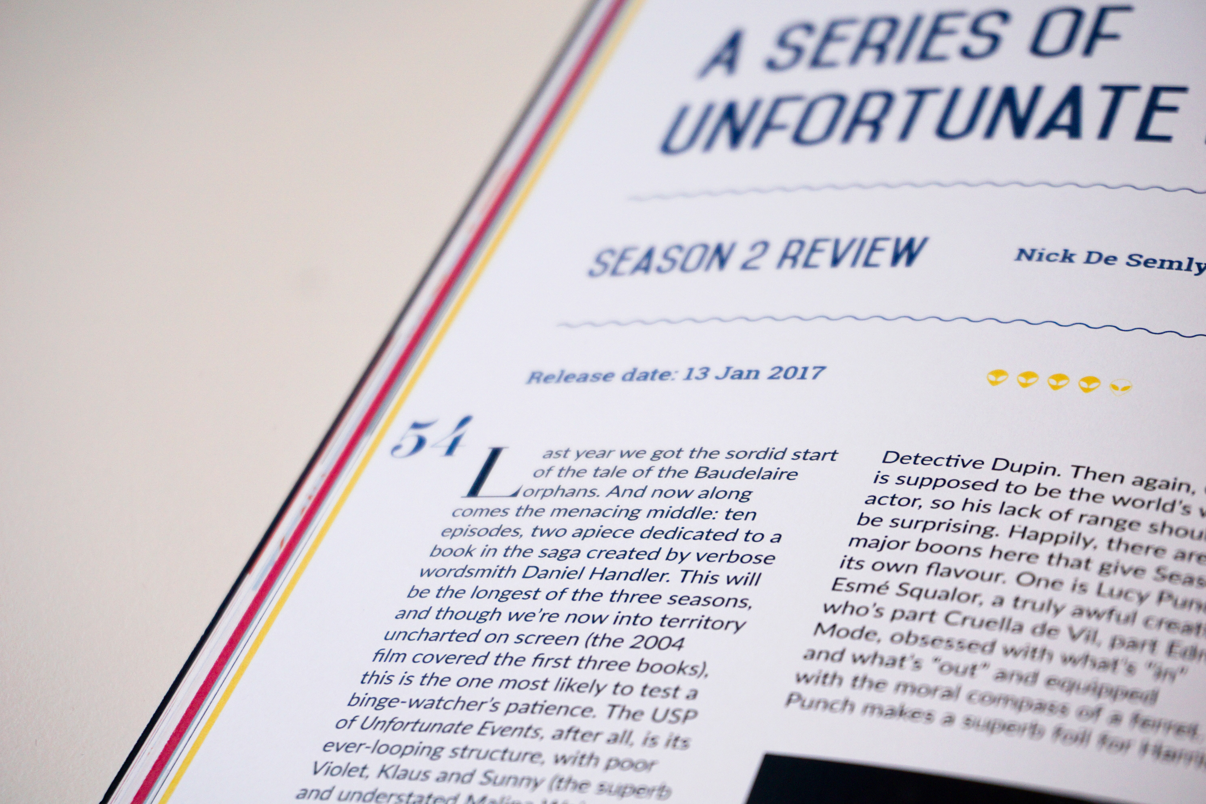
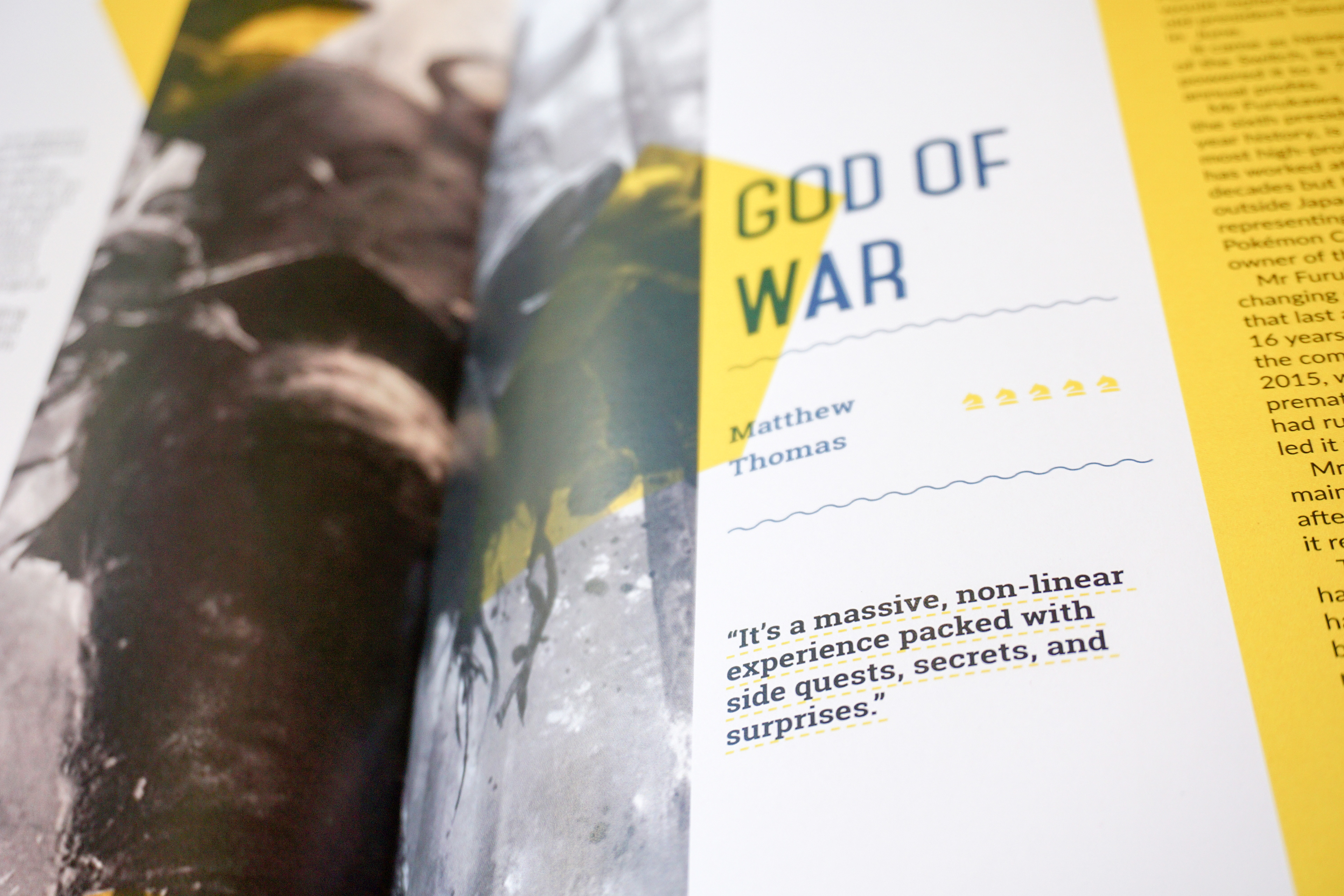
Instead of using stars as traditional rating symbol, I change it to hearts for movies (in cinema), aliens for streaming and TV series (at home) and chessmen for gaming. With this small changes, I wanted to make the magazine more fresh and contemporary.
Paper used for printing: matte finished
Cover: MUNKEN PURE 240gsm
Inside: MUNKEN PURE 150gsm
Inside: MUNKEN PURE 150gsm
Bonus: